bendega.com Making complex information easier to understand
May–Oct 2023
Understanding the background
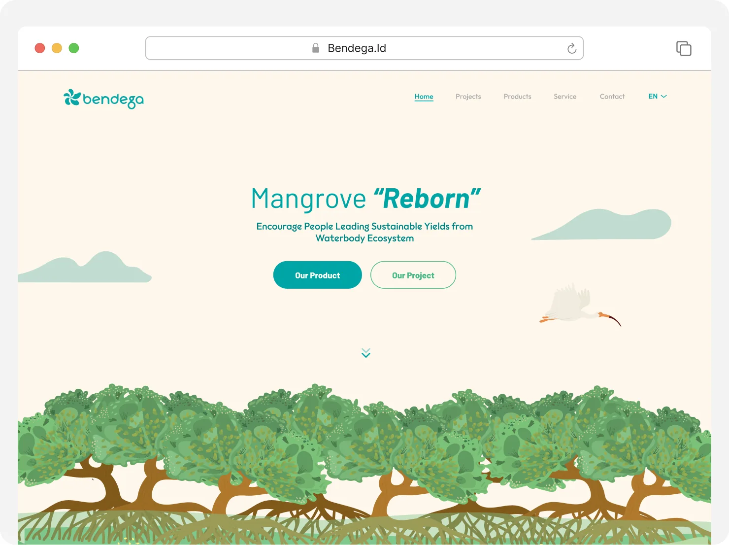
Bendega is a social-impact organisation that combines mangrove conservation with economic empowerment for fishermen and local communities. Its digital platform was created to communicate its conservation initiatives, community programs, partnerships, impact, and mangrove-based products.
The website already contained a large amount of valuable information. Visitors could find Bendega’s impact statistics, conservation programs, activity history, products, partners, testimonials, team members, and frequently asked questions.
However, having all of the information did not necessarily mean users could understand it. The main challenge was not a lack of content. It was the absence of a clear narrative connecting Bendega’s environmental mission, economic activities, and participation opportunities.
A rich website without a clear story
The existing homepage presented many important sections with almost equal visual emphasis.
Users moved from Bendega’s organisational introduction to impact statistics, conservation programs, sustainability commitments, past activities, partnerships, products, team profiles, FAQs, and testimonials. Each section was relevant on its own, but together they created a fragmented experience.
The research showed that users could find information, but they had difficulty:
- Understanding Bendega’s main purpose.
- Navigating between programs and products.
- Recognising how conservation supported local communities.
- Deciding what to explore or do next.
I evaluated the experience using:
- Task completion rate.
- Single Ease Question or SEQ.
- System Usability Scale or SUS.
- User observations and behavioural patterns.
- Post-test feedback.
- Net Promoter Score as an additional perception metric.
The research focused on four questions:
- Could users explain what Bendega was?
- Could they understand the relationship between conservation and products?
- Could they locate important information without guidance?
- Could they identify the next action relevant to them?
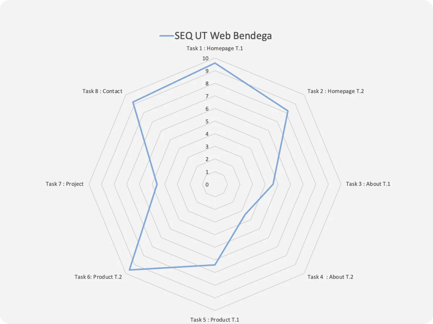
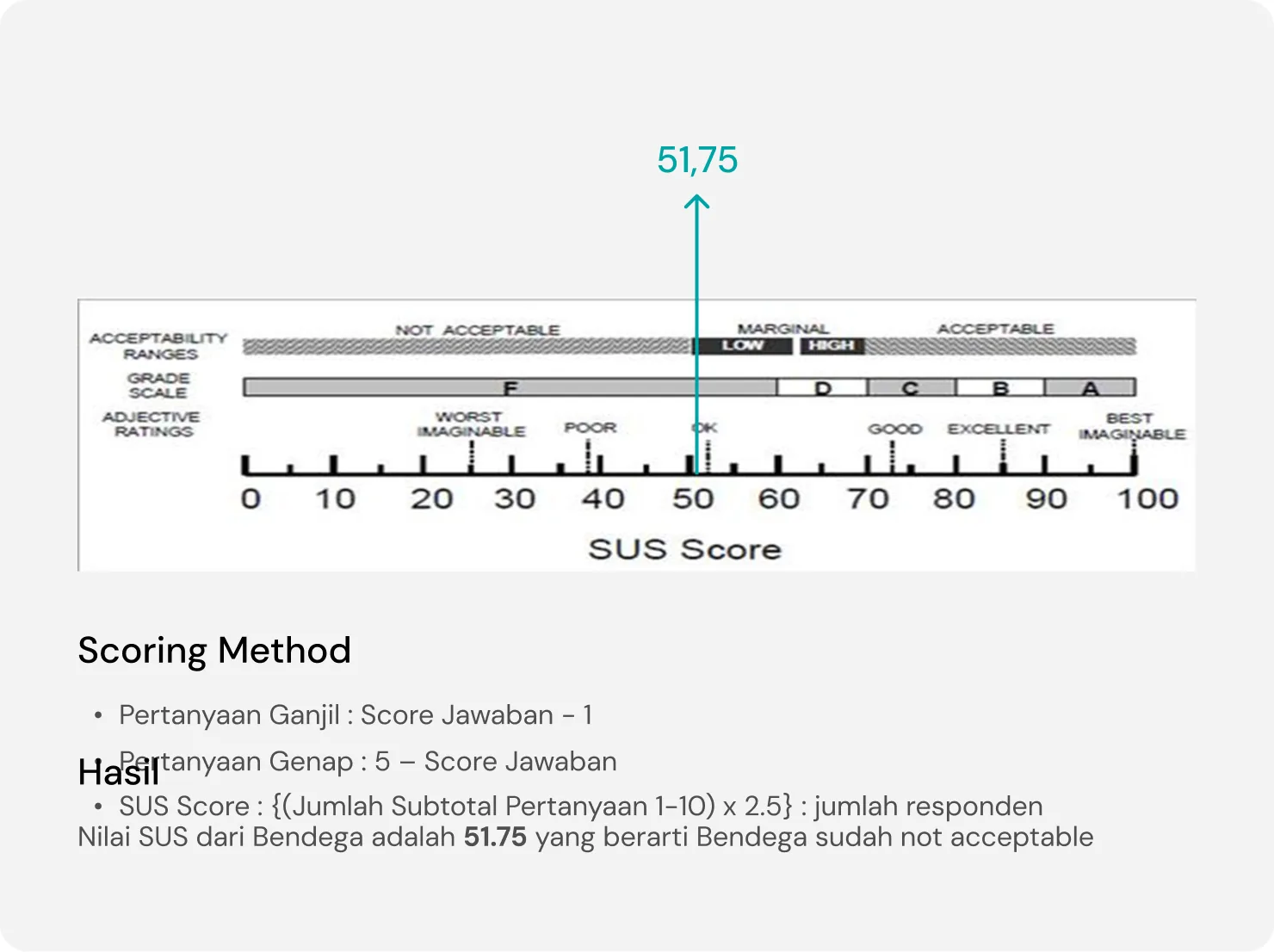
The website communicated many individual messages, but it did not guide users through one connected story. The existing website received a System Usability Scale score of 51.75, indicating that the overall usability was still below an acceptable level.
Turning findings into a design hypothesis
Based on the research, I developed the following hypothesis:
“If Bendega’s information was reorganised into one connected narrative, supported by clearer hierarchy and navigation, users would understand its ecosystem more quickly and complete important tasks more confidently.”
The redesign therefore focused on three priorities:
- Clarify the purpose. Users should understand what Bendega does from the beginning.
- Connect the ecosystem. Conservation, communities, products, and partnerships should appear as parts of the same system.
- Guide different intentions. Visitors should be able to learn, purchase products, participate, or collaborate without exploring the entire website first.
Redesigning the experience
I reorganised the website into a clearer sequence:
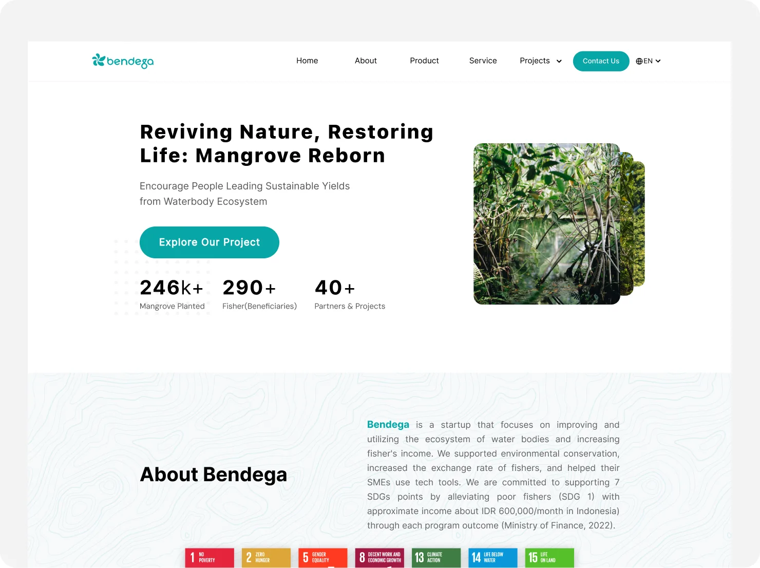
Bendega’s purpose → conservation activities → community impact → mangrove products → participation and collaboration.
The redesign improved the information architecture, content hierarchy, navigation, responsive behaviour, and visual consistency.
Instead of giving every section equal emphasis, the new experience prioritised the information users needed during their first visit. Supporting content such as detailed activity history, team information, and full organisational documentation could remain on secondary pages.
The visual system was also simplified. Illustrations remained part of Bendega’s identity, but they were balanced with clearer copy, real photography, product imagery, impact data, and more focused calls to action.
Validating the redesign
We grouped similar features and placed them closer to each other. Based on the test that we did, users can now navigate the account menu more easily because of feature renaming and group restructuring.
After completing the redesign, I conducted another usability evaluation using comparable tasks. The results showed substantial improvement:
- SUS increased from 51.75 to 85.75.
- Mobile task completion increased from 50% to 90%.
- Desktop task completion increased from 74% to 98%.
Users were able to understand Bendega’s purpose more clearly, find programs and products more easily, and navigate the experience with less hesitation.
These results supported the design hypothesis: the main improvement came from restructuring the information and clarifying the relationship between Bendega’s activities.
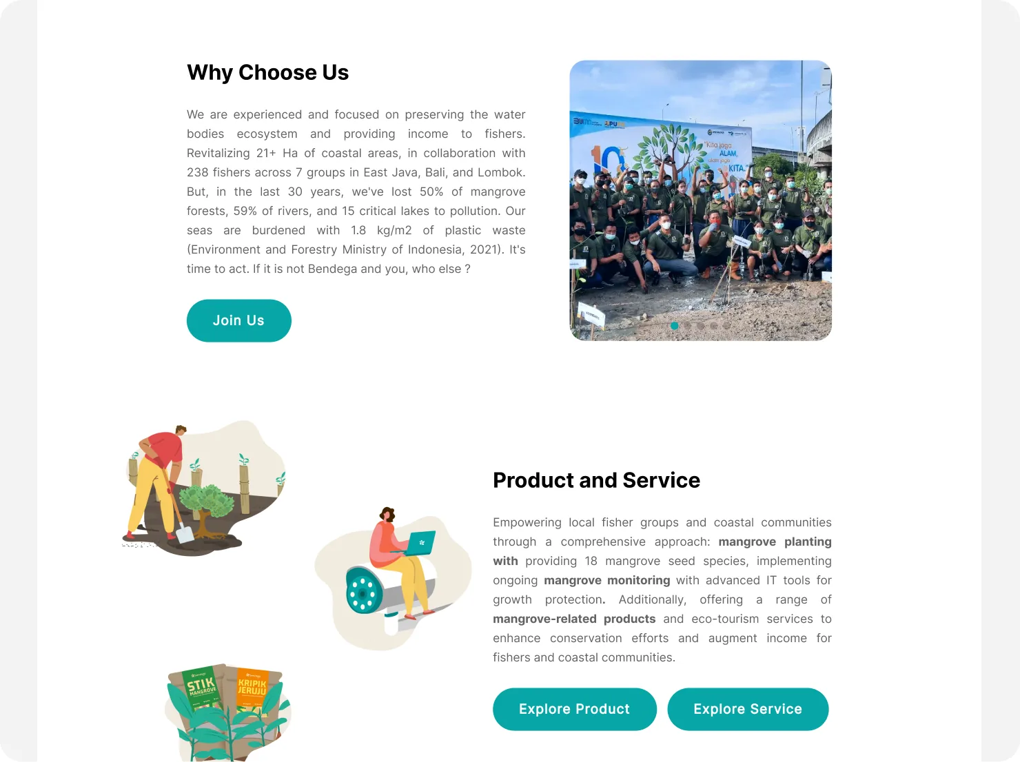
Exploring a more practical reframing
Although the redesign performed positively, implementing it would require broader changes to the existing visual system, components, responsive behaviour, and website structure. I therefore explored how the validated principles could be applied while retaining more of Bendega’s existing website.
The reframed version preserved the existing colours, illustrations, photography, and visual identity, but changed how the content was communicated.
- Reorganised the homepage around a clearer narrative.
- Rewrote and simplified the copy.
- Merged repetitive or competing sections.
- Used illustrations more selectively.
- Connected conservation activities with Lindur products.
- Created clearer paths for customers, volunteers, and potential partners.
The reframing was not another validated redesign. It was an implementation exploration based on the principles that had already performed positively in usability testing.
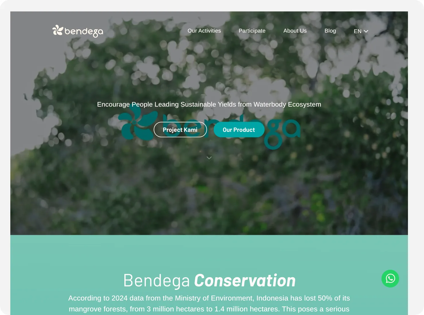
Two directions with different purposes
The full redesign represented the ideal long-term experience. It demonstrated how Bendega’s website could work with a stronger information architecture, visual system, and responsive foundation.
The reframing represented a more practical transition. It showed how Bendega could improve clarity and communication while preserving more of the current website and potentially reducing implementation effort.
The redesign answered:
What should the best experience become?
The reframing answered:
How could Bendega move toward that experience using what already exists?
Reflection
This project taught me that usability problems are not always caused by missing features or outdated visuals. Bendega already had valuable content and a distinctive identity. The deeper problem was that users could not easily understand how its conservation programs, products, communities, and partnerships worked together.
The redesign allowed me to validate a stronger experience. The reframing then challenged me to translate those validated insights into a more realistic implementation strategy.